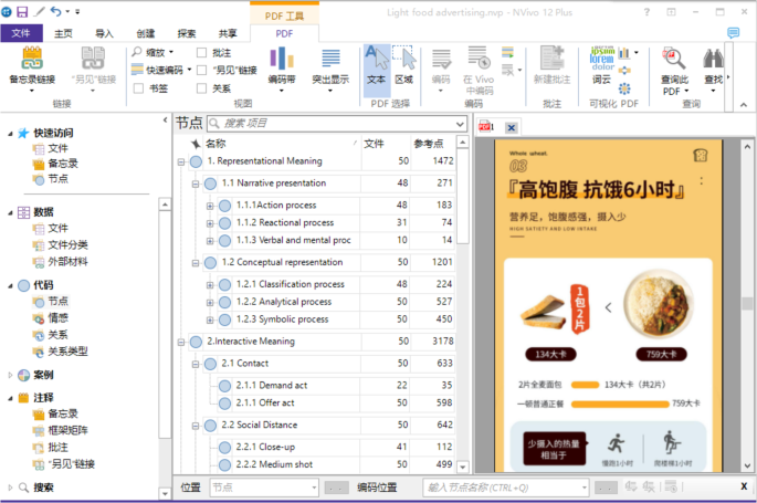
Textual–visual thematic analysis
Representational meaning: narrative and conceptual
The following text discusses Kress and van Leeuwen’s (2006) framework of representational meaning in visual communication, highlighting two main types: narrative representation and conceptual presentation. It explains that narrative representation focuses on dynamic events and actions, while conceptual presentation emphasizes stable and timeless essences. The key distinguishing factor is the presence of invisible oblique lines denoting direction. The narrative type involves dynamic processes like action, reaction, verbal, and mental processes, while the conceptual type encompasses classification, analytical, and symbolic processes. The analysis also delves into the roles and characteristics of these processes in advertising, emphasizing their influence on viewer perception and understanding. In the present study, this process is commonly used to display detailed information, mainly structured process, and specific features explained in the graph, largely unstructured process, of the products. Speaking of symbolic process, it explains one participant which is largely abstract or general in terms of the other which is specific. The roles involved in this process are carrier, participant whose meaning is established, and symbolic attributes who represents the meaning itself.
Our data in Table 1 reveal that conceptual representation is more prevalent than narrative representation, indicating that marketers of light food products prefer to use this approach for conveying information and promoting their products. In terms of narrative representation, action process is the most commonly used (28.91%), followed by reactional process (11.69%) and verbal process (2.21%). When it comes to conceptual representation, classification process is touched on in 224 images, accounting for 35.39%. Moreover, the most frequently used process types are analytical process and symbolic process, which make up 83.25% and 71.09%, respectively.
Table 1 Distribution and percentage of representational meaning.
Light food advertising utilizes different types of narrative representations to build a positive brand image and appeal to consumers. The focus on interaction between people and raw materials, as well as the naturalness and good quality of the product, is emphasized through transactional process. The dilemmas of body shape faced by people are also addressed to build a relatable brand image. Rigorousness and attention to detail are conveyed through reactional process, while the positive outcomes after eating the product are shown through action process. Verbal process is used to convince people of the product’s popularity through objective reviews from customers.
The process of generating meaning can be broken down into three types: classification, analytical, and symbolic. Classification involves grouping participants based on their status and class, with overt and covert taxonomy being the two sub-types. In advertising, covert taxonomy is commonly used to display product options. To sell e-commerce food products effectively, a classificational process is used to group flavors and ingredients, an analytical process is used to highlight specific product attributes, such as low GI, and a symbolic process is used to emphasize the products’ professionalism and credentials. The primary objective is to provide detailed information and promote sales by objectifying abstract features through symbolic representation.
Interactive meaning: contact, social distance, perspective, and modality
In Kress and van Leeuwen’s (2006) framework, representational meaning involves the relationship among participants within the image world, while interactive meaning extends to the physical world, emphasizing interactions between represented participants and viewers. Contact assesses gaze vector presence, demanding or offering engagement. Social distance is portrayed through the size of the frame, indicating closeness or alienation. Perspectives relate to angles, conveying involvement or detachment (horizontal) and power dynamics (vertical). Modality, categorized by degree, assesses image truthfulness based on color, depth, and illumination. Specific examples include contact through eyelines, social distance through frame size, and perspectives through angle selection, all influencing viewer perceptions. Our data in Table 2 show the different preferences of strategies employed. The offer act is used the most (94.47%), while the demand act is used less (5.53%). Medium shot is the most popular shot (78.83%), followed by close-up (17.69%) and long shot (4.90%). Frontal angle is used more often than oblique angle (63.35% vs. 37.28%). High angle and eye to eye angle are commonly used to convey equality. High modality (82.46%) is the most used to demonstrate product truthfulness. Overall, e-commerce food advertising prioritizes presenting detailed information and selling points through interactive means that actively involve customers and objectively convey product features.
Table 2 Distribution and percentage of interactive meaning.
Generally, eye contact from human, animal or personification objects may influence people’s perspective aligned with the theme of the images. And without eye contact with human or quasi-human, descriptions of goods tend to be more objective and customers may have more freedom in decision-making. Social distance like close-up shots showcase the natural characteristics of food. Medium shots are commonly used in online food advertising, creating a comfortable distance and providing a holistic view. Long shots represent a respectful public distance, emphasizing the product’s integration with society. This weakens its individuality and promotes its role in society, making it a symbol of the product’s social attribute.
According to Kress and van Leeuwen (2006), horizontal lines are used in the display to convey a sense of stillness or create a sense of movement. The frontal perspective creates a sense of immediacy or comparison and may also be intended to highlight a product’s features or benefits. An oblique perspective creates a sense of depth or dimension, as well as mystery or intrigue, and may present a product in a unique way. A high perspective is meant to present a product in a noble or ambitious manner, or to convey a sense of superiority or importance. The personal perspective creates a sense of intimacy or empathy, or presents the product in a way that you can identify with. A low perspective creates a sense of authority or power, or dramatically displays a product. In perspective, the frequent combination of high angles and front angles is beneficial for producers who educate people about new concepts, flavors, functions, etc. The joint effort of the high angle and the oblique angle aims to highlight the uniqueness of the product. The low angle is ignored in an online food ad with text placements and an eye-catching image.
According to Kress and van Leeuwen (2006), modality, a term used in functional grammar, is used to describe the credibility of images. The construction of naturalistic modality depends on factors such as color, depth, illumination, and details. Higher modality makes an image more credible. Therefore, the primary modality used in pictures is high, but middle or low modality may be used for special announcements. The attested cases of low modality can create a sense of mystery and curiosity.
Compositional meaning: information value, salience, and framing
Compositional meaning, as outlined by Kress and van Leeuwen (2006) and linked to the textual function in language, focuses on how images are organized within the visual realm. Information value dictates the distribution of information in images, with the top conveying ideal information, the bottom presenting real information, the left providing given information, the right introducing new information, and the center highlighting important information, while the margin contains unimportant information. Salience, representing information emphasis, captures the viewer’s attention through elements like color, size, position, and brightness. Framing, revealing the connection and disconnection of visual elements, employs techniques such as lines, empty spaces, color differentiation, and image outlines. In essence, compositional meaning aims to reveal intricate and structured frameworks for constructing images.
van Leeuwen (2005, 2008) provided insight into compositional meaning by showing how visual elements are arranged in images. As shown in Table 3, the position of elements is important for information value, with top-bottom being the most frequently used (90.21%). Color and size are the most common methods used to emphasize specific elements, while position and brightness are less important. Color differentiation is frequently used for framing (88.31%), followed by image outlines and empty spaces.
Table 3 Distribution and percentage of compositional meaning.
The detailed collocations in compositional meaning are as follows. In terms of information value, top-bottom and left-right are perfect matches which cater to the reading habits in the age of portrait screen and image-reading. Special attention should be paid to the common phenomenon contrary to what had been found by Kress and van Leeuwen (2006) that the left side represents new information, and the right side the given information. As for salience, color and size are two substantial methods to make certain element stand out, causing a strong visual punch to grab people’s attention. At last, a strongly framed example representing disconnection enjoys popularity, enabling people to navigate and distinguish different information swiftly and accurately.
Textual keywords and co-occurrence matrix
In this session, the focus will be on the analysis of the text in 50 light food advertisements found on the Taobao platform. The analysis will include examining the frequency of keywords used as in Table 4, as well as the collocation preferences of these words. In total, the analysis will consider 45,817 words. A word cloud in Fig. 4 displaying frequently used keywords is created to quickly and directly comprehend the emphasis of vocabulary in light food advertisements. The size of the words represents their frequency within the text. The most prominent words, such as “kcal,” “calorie,” “satiety,” “nutrition,” “protein,” and “content,” suggest that light food is associated with nutritious content, high protein, and reduced calorie intake for weight loss. However, this poses a dilemma for people, as reducing calorie intake may require less food ingestion or meal skipping, while consuming high-nutritional food may result in unwanted weight gain. Light food products offer a solution to this conflict, promising both nutrition and weight loss. The top 20 keywords focus on various positive descriptions of light food. The co-occurrence matrix is explored through SNA to uncover the underlying narrative logic behind keyword collocation preferences.
Fig. 4: Keywords cloud of light food advertising.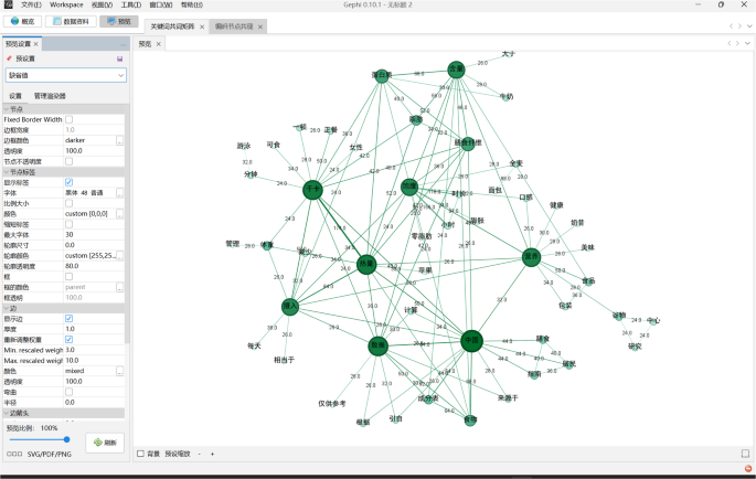
This figure shows the keywords cloud of light food advertising through Python. The larger the words, the more salient and important the words are, which can show the value emphasis of the light food advertising. This figure is created by Qian Yong, Xiaoqin Rao and is not covered by the Creative Commons Attribution 4.0 International License. Copyright Qian Yong, Xiaoqin Rao, all rights reserved.
Table 4 Top 20 keywords of light food advertising.
To further analyze the internal narrative logic in the persuasion process, a keyword co-occurrence matrix is created using Gephi 0.10.1 based on the previously generated keywords. In Fig. 5, the central part of the figure contains several words with higher prominence and larger icons, such as “calorie,” “kcal,” “China,” “data,” “nutrition,” “satiety,” “ingestion,” “content,” and “protein.” These co-occurrences can reveal the preferred word choices in marketing and the promotional tactics used to deepen customer recognition and gain their affection. The thicker the line between the keywords, the higher the relevance of the keywords. Therefore, we focus on analyzing the co-occurrence of the most prominent keywords. Based on their semantic meaning, the co-occurrence clusters are categorized into three main types: reducing calorie ingestion, nutrition and satiety, and citing the source of data as in Fig. 5.
Fig. 5: Keyword co-occurrence matrix.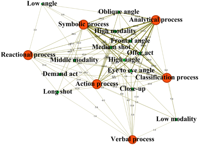
This figure shows the co-occurrence matrix of keywords generated before, indicating the internal connections among keywords. The thicker the lines between the keywords, the higher relevance of the keywords have. According to their semantic meaning, clusters of co-occurrence are classified into three main types: decreasing calorie ingestion, nutrition and satiety and source of data citation. This figure is created by Qian Yong, Xiaoqin Rao and is not covered by the Creative Commons Attribution 4.0 International License. Copyright Qian Yong, Xiaoqin Rao, all rights reserved.
To begin with, co-occurrence among “kcal,” “calorie,” and “ingestion” provides the possibility of effectively decreasing calorie intake. The primary concern for people is the concept of “calorie,” which is strongly linked to the growth of fat and causes anxiety for those pursuing beauty. The usage of “kcal,” “calorie, and “ingestion” form a triangle, with “kcal” being the unit for calculating calorie intake. This triangle demonstrates a high correlation between the three keywords, with “kcal” and “calorie” appearing together 78 times, “calorie” and “ingestion” 42 times, and “kcal” and “ingestion” 29 times. Advertisers intentionally compare “light food” with “regular meals,” typically referring to the calorie intake of an adult woman, to showcase the positive effects of their products. The explanation of calorie consumption often uses the term “minute” to make it more specific, as exercising is viewed as a time-consuming and grueling process. Additionally, the term “apple” is frequently used to indicate the low calorie of light food and promote healthy implications. It seems that it can save people from sweaty and energy-consuming exercise, and the only muscles that people need to exercise are the ones around their mouth; then, health and good shape will embrace them.
Secondly, the claim of low-calorie intake alone is insufficient to persuade individuals to purchase these products. “Nutrition” and “satiety” are two keywords to further prove the working mechanism of health maintenance and effortless weight loss, convincing people that they are making sensible food choices. “Satiety” eliminates the concern of being underfed, while “nutrition” promotes a healthy diet. The high “content” of “dietary fiber” and “protein” is emphasized, as they are crucial for human health. Protein is considered the primary material basis of the human body, while dietary fiber promotes intestinal absorption, weight control, and the elimination of metabolic waste. In addition, advertisers often compare the satiety duration of light food products with other foods without stating adequate amount, using the time unit “hours” to specify the product’s quality.
Finally, reference to authority can meet the pressing need to offer reliability and credibility to advertising rhetoric, making it free from suspicion of fabrication. Most of the “sources,” “references” or “citations” for “calculation” about data on calories, satiety length, nutritional content and explanation of calories come from Chinese Food Composition Table Standard Edition (29 times), a book focusing on analyzing food composition and summarizing food composition data, and Chinese Dietary Guidelines for Residents (16 times), a book giving advice on dietary choices based on scientific principles and dietary habits, compiled by the Chinese Nutrition Society. The use of numbers and data in advertising is widely accepted even without further supportive and authoritative evidence, as they are associated with science and rigor. However, the references to authoritative sources are often presented in small print and subtle colors, as the reference to authority is not a necessary condition for light food advertising to be credible. Additionally, the phrase “for reference only” is commonly used when the data comes from unverified sources, and the results may fluctuate or deviate.
In conclusion, keywords with high frequency leave a positive impression of light food. As for the keywords co-occurrence matrix, it displays the internal narrative logic of light food advertising, from possibility, working mechanism to reliability in health maintenance and effortless weight loss.
Visual co-occurrence matrix
The co-occurrence matrix graph between the three types of meaning (representational, interactive, and compositional) is shown in Figs. 6–8. The analytical and symbolic processes are closely related to both interactive and compositional meanings, forming the most densely distributed area. Top–bottom, size, color, outline of images, and color differentiation are commonly used in compositional meaning, while offer act, medium shot, frontal angle, high angle, and high modality are frequently used in interactive meaning. These elements coexist and form the most densely distributed area in the graph. The whole co-occurrence matrix of the three, namely, representational meaning (red), interactive meaning (green) and compositional meaning (blue), can be perceived in Fig. 9. It is easy to find that all the coding with the highest proportion of co-occurrence nearly commensurate to the elements with the highest percentage in three dimensions of VG, respectively, embodying different focus in each layer.
Fig. 6: Visual co-occurrence matrix I.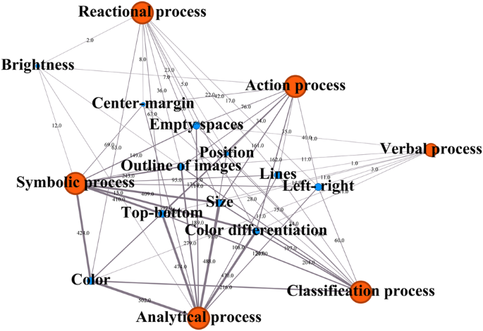
This figure is produced based on visual coding co-occurrence data in Nvivo12 Plus through Gephi 0.10.1. It shows the co-occurrence matrix of visual coding between representational meaning (red) and interactive meaning (green) in terms of visual grammar. The thicker the lines between the coding, the higher relevance of the coding has. This figure is created by Qian Yong, Xiaoqin Rao and is not covered by the Creative Commons Attribution 4.0 International License. Copyright Qian Yong, Xiaoqin Rao, all rights reserved.
Fig. 7: Visual co-occurrence matrix II.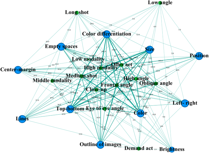
This figure is produced based on visual coding co-occurrence data in Nvivo12 Plus through Gephi 0.10.1. It shows the co-occurrence matrix of visual coding between representational meaning (red) and compositional meaning (blue) in terms of visual grammar. The thicker the lines between the coding, the higher relevance of the coding has. This figure is created by Qian Yong, Xiaoqin Rao and is not covered by the Creative Commons Attribution 4.0 International License. Copyright Qian Yong, Xiaoqin Rao, all rights reserved.
Fig. 8: Visual co-occurrence matrix III.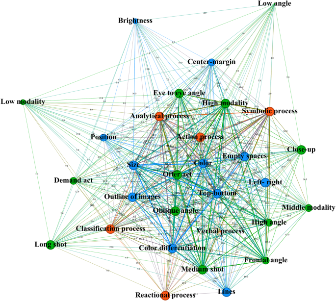
Visual Co-occurrence Matrix II. This figure is produced based on visual coding co-occurrence data in Nvivo12 Plus through Gephi 0.10.1. It shows the co-occurrence matrix of visual coding between compositional meaning (blue) and interactive meaning (green) in terms of visual grammar. The thicker the lines between the coding, the higher relevance of the coding has. This figure is created by Qian Yong, Xiaoqin Rao and is not covered by the Creative Commons Attribution 4.0 International License. Copyright Qian Yong, Xiaoqin Rao, all rights reserved.
Fig. 9: Visual Co-occurrence Matrix IV.
This figure is produced based on visual coding co-occurrence data in Nvivo12 Plus through Gephi 0.10.1. It shows the co-occurrence matrix of three meanings, namely, representational meaning (red), interactive meaning (green) and compositional meaning (blue) in terms of visual grammar. It concludes that the coding with the highest proportion of co-occurrence is nearly commensurate to the elements with the highest frequency in each dimension of visual grammar. This figure is created by Qian Yong, Xiaoqin Rao and is not covered by the Creative Commons Attribution 4.0 International License. Copyright Qian Yong, Xiaoqin Rao, all rights reserved.
If we take the data as a whole unit in the visual arrangement in light food advertising, there are some inevitable contradictions in image arrangements. On the one hand, it conveys that light food advertising is relatively so objective that customers are given full freedom, decision-making power and the ideal advertiser-customer relationship, to purchase, free from manipulation and control. It can be seen from the adoptions of conceptual representation, specifically through analytical process and symbolic process which are to present relatively stable essence as structure and specific abstract features of light food, and offer act displaying information only, leaving judgment to buyers. On the other hand, however, it is also seductive in influencing people’s purchase. The comfortable distance created by medium shot, persuasive involvement through frontal angle, the superior status of customers given by high angle and attractive truthfulness of food has created perfect hothouses to allure people to jump into the pool of consumption, accompanied by top-bottom adapting to contemporary reading habits and marketing tactics online, visual punch that is hard to ignore by bigger size and brighter color, information bombarded achieved by outline of images and color differentiation in framing. To put it simply, the image layout of light food advertising is contradictory and indefinite superficially, but the manipulative intentions behind the promotion are consistent and definite in the physical world, to influence or even control people’s notion and purchase of light food implicitly. In addition, claiming noninterference with consumers’ judgment in purchasing, intervention and manipulation can be seen in other aspects. Through the configuration of visual elements, advertisers convey that negative situation that plague people can be appeased by light food. For example, light food can bring you companionship at midnight under the “996” work regime, allow you to sleep for half an hour more in society afflicted by rat race, save you from unsanitary takeout food by cook a good meal quickly and help you say goodbye to body anxiety and embrace a self-disciplined life. It provides people with the illusion of that light food on their hands, and problems die out. And changing people’s awful lives is the major mission of light food products. Finally, the image of it is becoming increasingly mysterious and even sacred.
Contradictions between visual and textual information
One of the main contradictions between visual and textual information in light food advertising is the use of manipulative visuals to lure the consumers, while the textual information claims that the food is healthy and nutritious. For instance, an advertisement for a light salad may show a picture of a small plate with fresh vegetables and herbs, while the text may state that the salad is low in calories and fat-free. However, the salad dressing may contain high amounts of sugar and sodium, which are not disclosed in the visual representation. Another example is the use of exaggerated portion sizes in advertisements for light foods. For instance, a cereal brand may depict a large bowl of cereal overflowing with fresh fruit, while claiming on the packaging that the serving size is just half a cup. This can be misleading to consumers who may assume that they can eat as much as they want without consuming too many calories. Additionally, some light food advertisements may use language that implies health benefits that are not supported by scientific evidence. For example, a beverage brand may claim that their product is “detoxifying” or “cleansing,” despite there being no evidence to support these claims. The use of such language can create a false impression that the product is healthier than it actually is.
Another contradiction is the use of ambiguous terms in the textual information, which can mislead the consumers. Light food advertising often uses ambiguous terms in their textual information, such as “low-fat” or “reduced-calorie,” which may not necessarily mean that the food is healthy. These terms can be misleading, especially when accompanied by visuals that depict the food as indulgent or decadent.
Moreover, some light food advertisements may use misleading visuals to promote a healthy or ethical image, while the text may not provide any concrete information regarding the ingredients or production methods. For instance, an advertisement for a plant-based burger may show a picture of a happy cow in a green field, while the text may not specify whether the burger is made with organic or genetically modified soybeans. Another example of misleading visuals in light food advertising is the use of bright, colorful packaging and attractive images of fruits and vegetables, even if the product contains only a small amount of these ingredients. This can create the perception that the product is healthy and nutritious, when in fact it may contain high levels of sugar, salt, and artificial ingredients.

